Making Plots Pretty Part 1: laying the foundation#
Over the next two lessons, we explore the level of customization depth that is possible through a step-by-step introduction to ways in which plots can be customized. In this lesson, we’ll create a figure that we’ll use as our running example throughout. We’ll use this session to make a decent plot: one that accurately reflects our data and is acceptably clear for the reader to understand. In the next lesson, we’ll customize this in numerous ways.
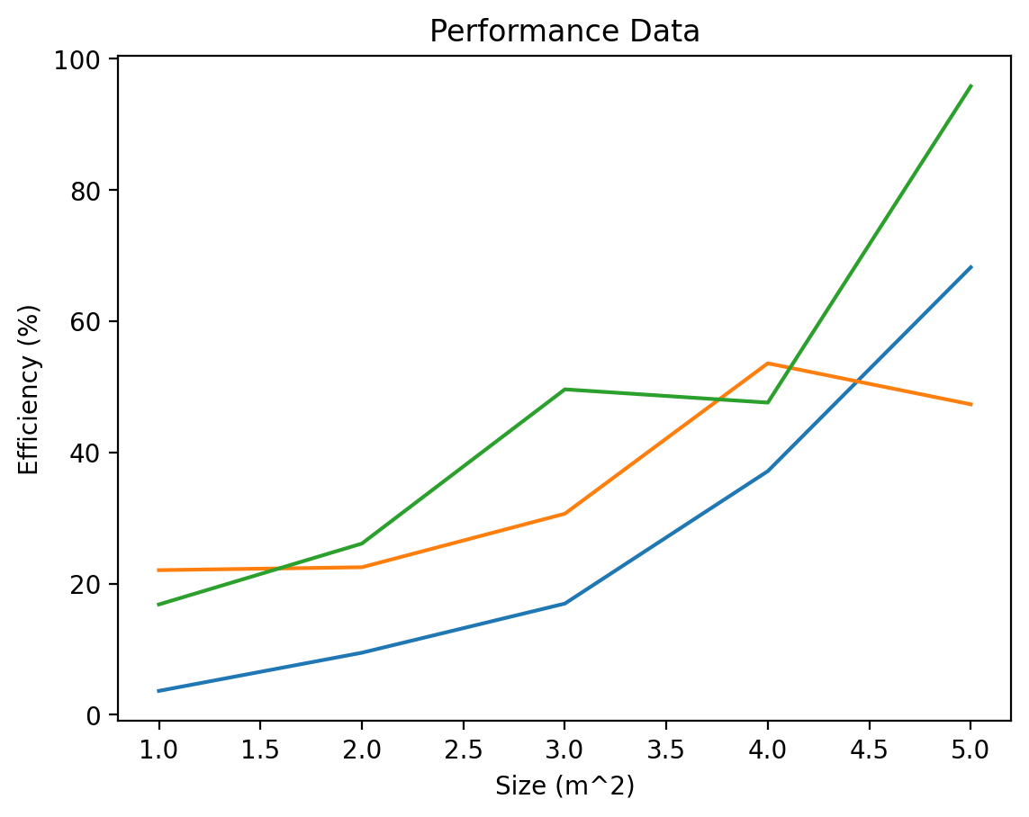
Let’s create some data that is meant to be used to compare three different models: Model A, Model B, and Model C. Each model takes as input an area parameter we want to plot the efficiency of each model across the possible values of size. After we create the data, we’ll make a basic plot of those data.
# Create some data to plot
x = [1, 2, 3, 4, 5]
y1 = [3.64, 9.46, 16.95, 37.14, 68.22]
y2 = [22.05, 22.49, 30.65, 53.58, 47.33]
y3 = [16.82, 26.10, 49.61, 47.59, 95.82]
%config InlineBackend.figure_format = 'retina'
import matplotlib.pyplot as plt

fig, ax = plt.subplots()
ax.plot(x, y1)
ax.plot(x, y2)
ax.plot(x, y3)
ax.set_title("Performance Data")
ax.set_xlabel("Size (m^2)")
ax.set_ylabel("Efficiency (%)")
plt.show()
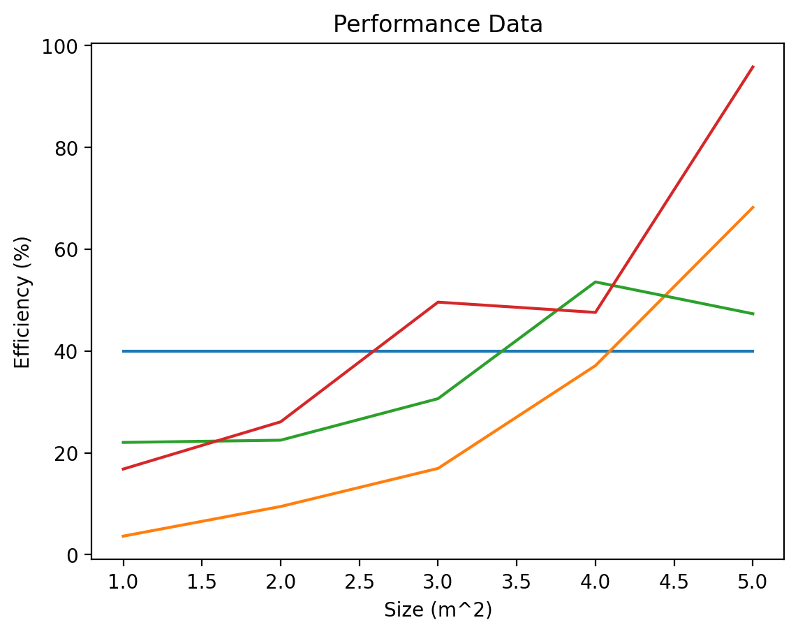
Now, let’s say we want to add a baseline model for comparison - one that is constant for all x values. We can do this by creating a pair of points that correspond to the baseline value; let’s say the baseline value is 40. Then we want to draw a line from (1,40) to (5,40). We can do that as follows:
baseline = 40

fig, ax = plt.subplots()

ax.plot([x[0], x[-1]], [baseline, baseline])  # Plot the baseline
ax.plot(x, y1)
ax.plot(x, y2)
ax.plot(x, y3)

ax.set_title("Performance Data")
ax.set_xlabel("Size (m^2)")
ax.set_ylabel("Efficiency (%)")
plt.show()
We can add a legend by incorporating additional keyword parameter of “label” for each of the plots, to designate what these lines should each be called, then calling the legend method to add it to the selected axes.
fig, ax = plt.subplots()

ax.plot([x[0], x[-1]], [baseline, baseline], label="Baseline")  # Plot the baseline
ax.plot(x, y1, label="Model A")
ax.plot(x, y2, label="Model B")
ax.plot(x, y3, label="Model C")

ax.set_title("Performance Data")
ax.set_xlabel("Size (m^2)")
ax.set_ylabel("Efficiency (%)")
ax.legend()
plt.show()
Remember one of our key software engineering insights: never repeat yourself. Here, we repeat ourselves a bit when we have three plotting lines, one for each model, A, B, and C. We can add one final refinement by performing this inside a loop. We’ll also save our figure to file.
baseline = 40
labels = ["Model A", "Model B", "Model C"]  # Capture the labels in a list
y = [y1, y2, y3]  # Store each series of the data in one list

fig, ax = plt.subplots()

ax.plot([x[0], x[-1]], [baseline, baseline], label="Baseline")  # Plot the baseline
# Plot the three model lines
for i, label in enumerate(labels):
    plt.plot(x, y[i], label=label)

ax.set_title("Performance Data")
ax.set_xlabel("Size (m^2)")
ax.set_ylabel("Efficiency (%)")
ax.legend()

fig.savefig("img/good-plot.png", dpi=300)
This is a decent plot. It accurately communicates our data, it labels all axes and provides units, and it provides a legend to understand the meaning of each line.
However, there are several ways this could be improved. It could make better use of color to communicate something more clearly. It could have fewer lines to be less distracting and help to maximize the “data-to-ink” ratio for the plot. The overall style of the plot could be more compelling for a reader.
Let’s take action on each of these and discuss some common customizations we may be interested in applying in the next lesson, walking us through how to go from a decent plot to a great one.