Heat maps#
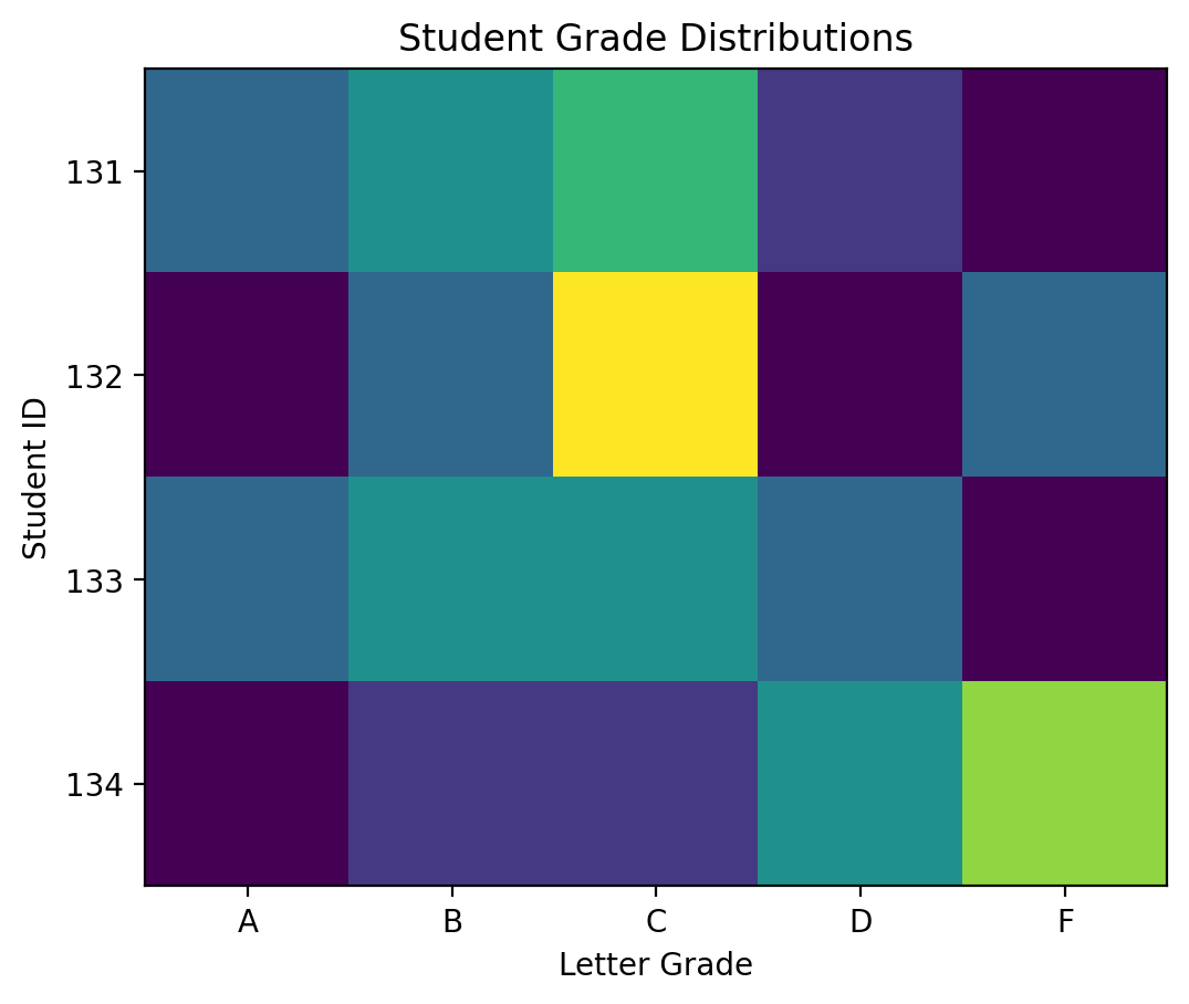
Sometimes we want to visualize tabular data, but there are too many entries for bar plots or line plots and a table itself would not easily reveal patterns. In this case, a heat map can be an effective tool for visualizing your data. Imagine that we have a 2D array represents student grades where the x-axis represents the grades (A-F) and the y labels each represent a different student with student ID numbers. Each entry is the percentage of grades the student received of that letter grade (so the sum across the columns is 100 for each row). Let’s start by displaying our data first:
%config InlineBackend.figure_format = 'retina'

import matplotlib.pyplot as plt
import numpy as np

letter_grades = ["A", "B", "C", "D", "F"]
student_ids = ["131", "132", "133", "134"]

grades = np.array(
    [[20, 30, 40, 10, 0], [0, 20, 60, 0, 20], [20, 30, 30, 20, 0], [0, 10, 10, 30, 50]]
)
grades
array([[20, 30, 40, 10,  0],
       [ 0, 20, 60,  0, 20],
       [20, 30, 30, 20,  0],
       [ 0, 10, 10, 30, 50]])
Now, let’s plot the heatmap. We can do this using the imshow() method which plots each entry in the 2D array as a color where the color varies based on the magnitude of the entry. Let’s plot the array and set the tick labels to match our data.
fig, ax = plt.subplots()

heatmap = ax.imshow(grades)

ax.set_xticks(np.arange(len(letter_grades)))
ax.set_xticklabels(letter_grades)
ax.set_yticks(np.arange(len(student_ids)))
ax.set_yticklabels(student_ids)

ax.set_xlabel("Letter Grade")
ax.set_ylabel("Student ID")
ax.set_title("Student Grade Distributions")
Text(0.5, 1.0, 'Student Grade Distributions')
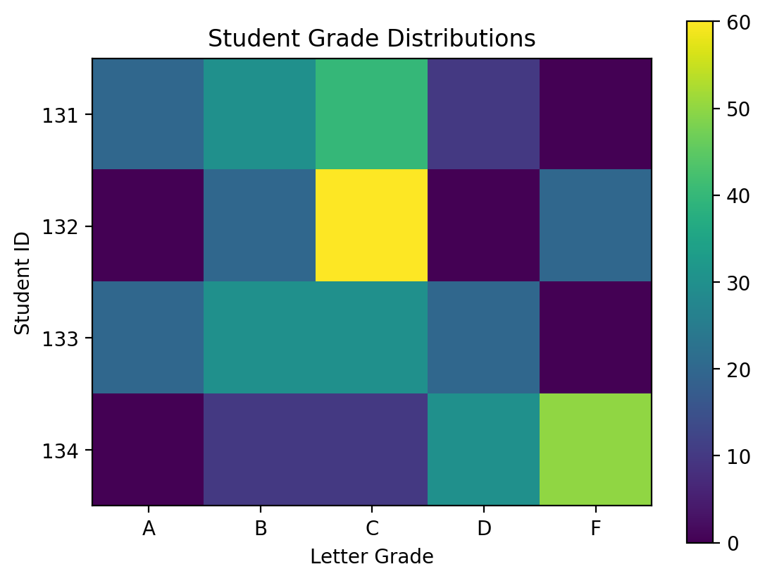
The problem we have here is that we don’t know what the colors represent in terms of the numbers of grade. Let’s add a color bar that provides that information. A colorbar is a new set of axes that displays the color. We apply the colorbar method to the figure and specify the image that we’re plotting from which colorbar determines what each color represents in terms of values in the array and then the axes object adjacent to which the colorbar will be placed.
fig, ax = plt.subplots()

heatmap = ax.imshow(grades)

ax.set_xticks(np.arange(len(letter_grades)))
ax.set_xticklabels(letter_grades)
ax.set_yticks(np.arange(len(student_ids)))
ax.set_yticklabels(student_ids)

ax.set_xlabel("Letter Grade")
ax.set_ylabel("Student ID")
ax.set_title("Student Grade Distributions")

fig.colorbar(heatmap, ax=ax)
<matplotlib.colorbar.Colorbar at 0x134526a50>
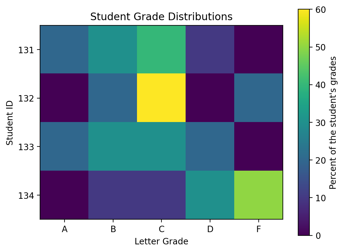
Next, let’s label the colorbar axis so we clearly communicate what it means.
fig, ax = plt.subplots()

heatmap = ax.imshow(grades)

ax.set_xticks(np.arange(len(letter_grades)))
ax.set_xticklabels(letter_grades)
ax.set_yticks(np.arange(len(student_ids)))
ax.set_yticklabels(student_ids)

ax.set_xlabel("Letter Grade")
ax.set_ylabel("Student ID")
ax.set_title("Student Grade Distributions")

fig.colorbar(heatmap, ax=ax, label="Percent of the student's grades")
<matplotlib.colorbar.Colorbar at 0x1342c0ce0>
Sometimes, it’s even clearer, yet, to directly write the values of each entry in the image. To do this, we can simply plot text at the center of each of the grid cells. We’ll make them white so they’re more easily read.
fig, ax = plt.subplots()

heatmap = ax.imshow(grades)

ax.set_xticks(np.arange(len(letter_grades)))
ax.set_xticklabels(letter_grades)
ax.set_yticks(np.arange(len(student_ids)))
ax.set_yticklabels(student_ids)

ax.set_xlabel("Letter Grade")
ax.set_ylabel("Student ID")
ax.set_title("Student Grade Distributions")

fig.colorbar(heatmap, ax=ax, label="Percent of the student's grades")

# Plot the text labels for each grid cell
for y in range(len(student_ids)):
    for x in range(len(letter_grades)):
        ax.text(
            x,
            y,
            grades[y, x],
            horizontalalignment="center",
            verticalalignment="center",
            color="w",
        )

There’s a lot we can do with heatmaps and we’ll return to these later in the course as we explore two-dimensional histograms.