Doing more with scatter plots#
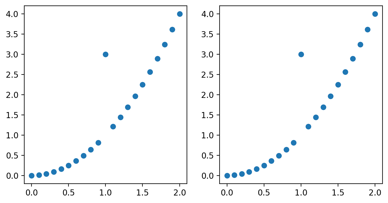
One thing you may notice is that you can do similar things with both the plot() and scatter() methods if you use plot and set the markers. Let’s turn off the lines for plot() by setting the linestyle keyword argument to ‘None’ and set the marker to be a circle. For a full list of options for markers and what the look like, see this page of the documentation.
%config InlineBackend.figure_format = 'retina'

import matplotlib.pyplot as plt
import numpy as np

np.random.seed(42)
x = np.linspace(0, 2, 21)
y = x**2
y[10] = 3
fig, axs = plt.subplots(1, 2, figsize=(8, 4))
axs[0].scatter(x, y)
axs[1].plot(x, y, marker="o", linestyle="None")
[<matplotlib.lines.Line2D at 0x1523245f0>]
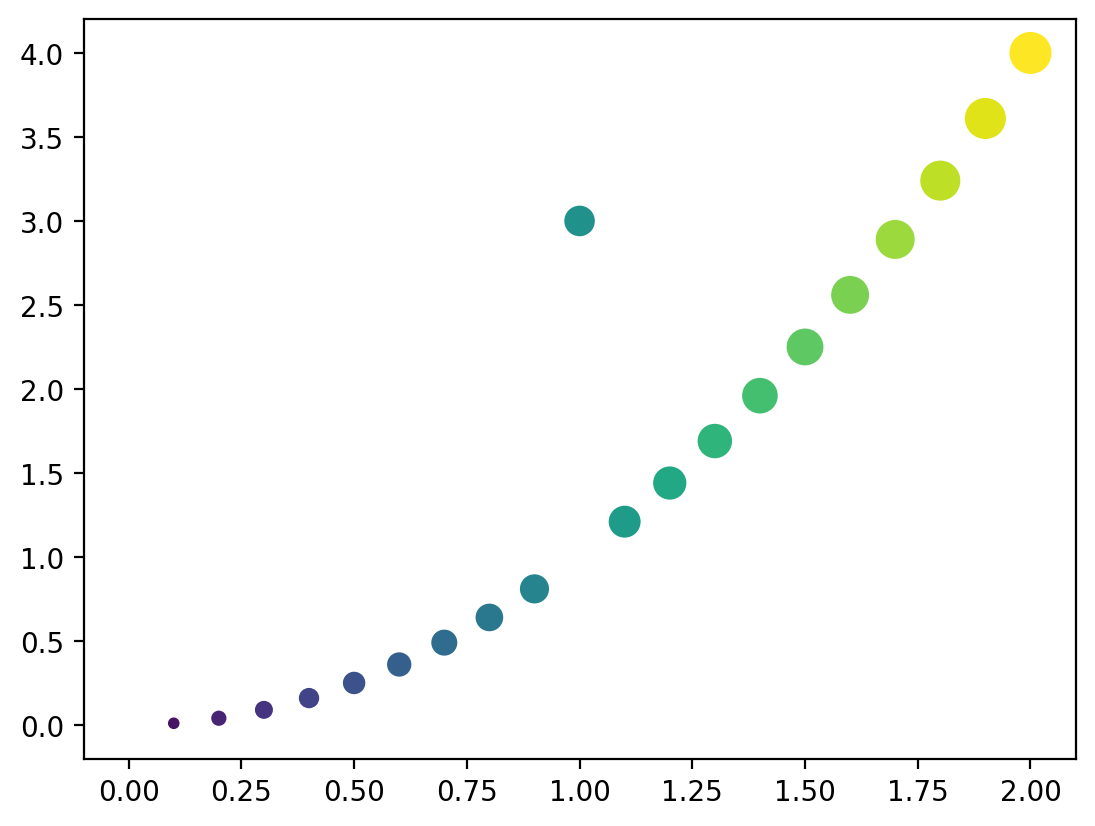
These look identical and so we might question why use the scatter() method at all? What the scatter method enables is for color of the marker and the size of the marker to be easily adjust with the data. This is also possible using plot, but takes more work. Let’s see this in action: Let’s set the color and the size of the circles to change along with the x value in the above plot. To do this we set the c and s keyword arguments of scatter which sets the color and size of the markers accordingly. Since out x values only go up to 2 and a marker size of 2 is very small, we multiply the sizes by 100 to see the full effect of the change in size:
fig, ax = plt.subplots()
ax.scatter(x, y, c=x, s=x * 100)
<matplotlib.collections.PathCollection at 0x152392e40>
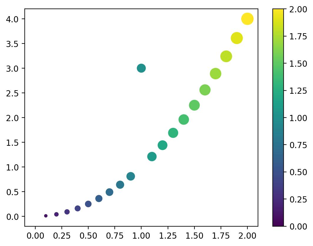
Here we can see that the colors and the size of the markers are changing with the x parameters. We can even add a colorbar:
fig, ax = plt.subplots()
scatter = ax.scatter(x, y, c=x, s=x * 100)
fig.colorbar(scatter, ax=ax)
<matplotlib.colorbar.Colorbar at 0x15243ef60>
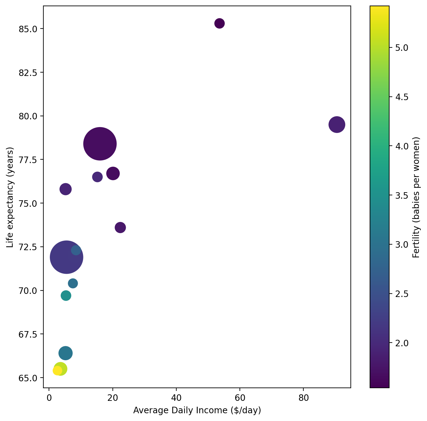
Now, let’s apply this to some real world data on statistics of various countries compiled from GapMinder data. Let’s read our data in first.
import pandas as pd

data = pd.read_csv("data/gap-minder-statistics.csv")
data
| country | population | fertility | life_expectancy | average_daily_income | |
|---|---|---|---|---|---|
| 0 | Afghanistan | 42.20 | 3.65 | 64.0 | 3.10 |
| 1 | Angola | 36.70 | 5.21 | 65.9 | 4.63 |
| 2 | Albania | 2.83 | 1.70 | 77.3 | 16.90 |
| 3 | UAE | 9.52 | 1.65 | 74.6 | 82.90 |
| 4 | Argentina | 45.80 | 2.19 | 77.3 | 21.30 |
| ... | ... | ... | ... | ... | ... |
| 154 | Vietnam | 98.90 | 1.93 | 75.1 | 17.00 |
| 155 | Yemen | 34.40 | 3.37 | 67.2 | 2.16 |
| 156 | South Africa | 60.40 | 2.29 | 61.9 | 11.40 |
| 157 | Zambia | 20.60 | 4.60 | 63.4 | 2.94 |
| 158 | Zimbabwe | 16.70 | 3.29 | 61.7 | 4.46 |
159 rows × 5 columns
Our data consists of five columns:
The country/region name
The population of that region in millions of people
The fertility rate in child per woman
Average life expectancy in years
Average daily income in inflation and price adjusted dollars per day
For most plot, being able to represent four separate quantities would be nearly impossible. However, with scatter plots we have two additional dimensions to work with: marker size and color. Let’s use these to our advantage and make a scatter plot of life expectancy versus average daily income and set the size of the markers to be proportional to the population and the color to represent fertility rate.
Let’s focus on the 15 largest countries by population for legibility as well:
largest = data.sort_values(by="population", ascending=False).iloc[:15]
largest
| country | population | fertility | life_expectancy | average_daily_income | |
|---|---|---|---|---|---|
| 25 | China | 1430.0 | 1.67 | 78.4 | 16.00 |
| 64 | India | 1430.0 | 2.18 | 71.9 | 5.49 |
| 151 | USA | 340.0 | 1.89 | 79.5 | 90.50 |
| 63 | Indonesia | 278.0 | 2.20 | 72.0 | 8.12 |
| 109 | Pakistan | 240.0 | 3.07 | 66.4 | 5.18 |
| 102 | Nigeria | 224.0 | 5.05 | 65.5 | 3.58 |
| 19 | Brazil | 216.0 | 1.65 | 76.7 | 20.10 |
| 13 | Bangladesh | 173.0 | 1.93 | 75.8 | 5.19 |
| 121 | Russia | 144.0 | 1.79 | 73.6 | 22.40 |
| 90 | Mexico | 128.0 | 1.99 | 76.5 | 15.20 |
| 45 | Ethiopia | 127.0 | 3.47 | 69.7 | 5.31 |
| 72 | Japan | 123.0 | 1.54 | 85.3 | 53.60 |
| 112 | Philippines | 117.0 | 2.72 | 72.3 | 8.48 |
| 41 | Egypt | 113.0 | 2.95 | 70.4 | 7.49 |
| 28 | Congo, Dem. Rep. | 102.0 | 5.42 | 65.4 | 2.63 |
fig, ax = plt.subplots(
    figsize=(8, 8)
)  # We'll also make the figure size a bit bigger to accommodate the additional data.

scatter = ax.scatter(
    largest["average_daily_income"],
    largest["life_expectancy"],
    c=largest["fertility"],
    s=largest["population"],
)
ax.set_xlabel("Average Daily Income ($/day)")
ax.set_ylabel("Life expectancy (years)")

fig.colorbar(scatter, ax=ax, label="Fertility (babies per women)")
<matplotlib.colorbar.Colorbar at 0x1521c5ee0>
Since the data is squished onto the left side of the plot, let’s apply a log scale to the x values
fig, ax = plt.subplots(
    figsize=(8, 8)
)  # We'll also make the figure size a bit bigger to accommodate the additional data.

scatter = ax.scatter(
    largest["average_daily_income"],
    largest["life_expectancy"],
    c=largest["fertility"],
    s=largest["population"],
)
ax.set_xlabel("Average Daily Income ($/day)")
ax.set_ylabel("Life expectancy (years)")
ax.set_xscale("log")

fig.colorbar(scatter, ax=ax, label="Fertility (babies per women)")
<matplotlib.colorbar.Colorbar at 0x150cfc410>
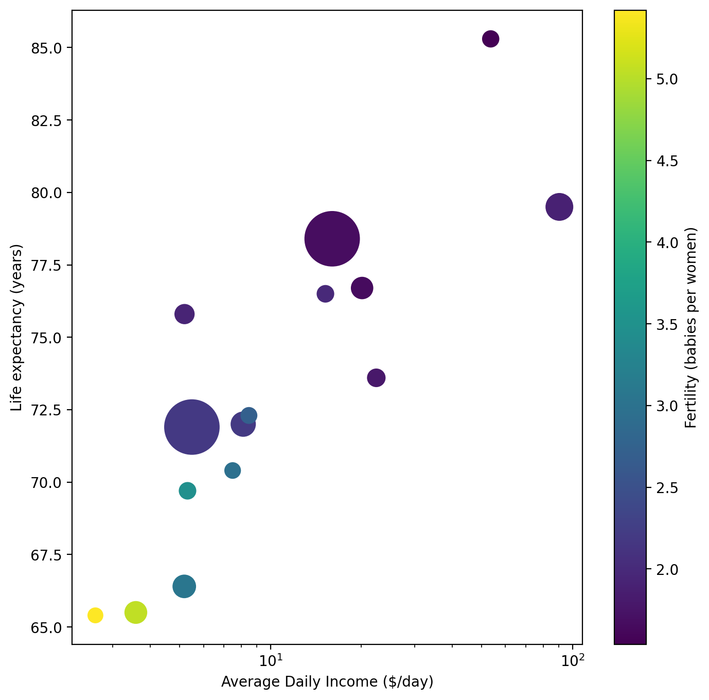
This is looking much better! Of course, we still don’t know which circle is which. Let’s use what we learned with text plotting to enhance this plot by adding text labels for each of the names of the countries.
fig, ax = plt.subplots(
    figsize=(8, 8)
)  # We'll also make the figure size a bit bigger to accommodate the additional data.

scatter = ax.scatter(
    largest["average_daily_income"],
    largest["life_expectancy"],
    c=largest["fertility"],
    s=largest["population"],
)
ax.set_xlabel("Average Daily Income ($/day)")
ax.set_ylabel("Life expectancy (years)")
ax.set_xscale("log")

fig.colorbar(scatter, ax=ax, label="Fertility (babies per women)")

for vx, vy, vs in zip(
    largest["average_daily_income"], largest["life_expectancy"], largest["country"]
):
    ax.text(vx, vy, vs, fontsize=8, color="gray")

Now this is a plot that clearly presents multiple characteristics in a coherent way. One additional enhancement could be a legend so we could tell the differences between marker size values more clearly, but we’ll explore that later in a deep dive on legends.
At this point, though, we’ve created many types of plots. We typically want to package these in reports or presentations and to do so, we need to save our figures to file. Let’s learn how to do that next!