Subplots#
A common need in making plots is to show plots what are on different axes side-by-side. Perhaps we want to show over the same period how sales and stock prices vary, or maybe we’re showing the relationship between purchases and pageviews on one plot and purchases and duration on a page on another. We can easily create as many subplots as we’d like with matplotlib.
Basic subplots#
We typically do this using the subplots method to create a grid. If we use the command fig, axs = plt.subplots(n,m), matplotlib will to create a figure (fig) that contains a grid of axes (axs) that has n rows and m columns. The axs variable then becomes an array of size n-by-m. Each individual element of the axs array is then a set of axes that we can plot onto.
Note: for clarity, we adopt the convention that ax is used for a single axes object and axs is used for multiple axes as in a set of subplots, for clarity.
Let’s start with a simple example with two plots organized in one row and two columns:
%config InlineBackend.figure_format = 'retina'
import matplotlib.pyplot as plt
import numpy as np

fig, axs = plt.subplots(1, 2)  # nrows, ncols of axes
axs
array([<Axes: >, <Axes: >], dtype=object)
We can see that two plots are created as expected and the axs object is an array with two elements. Now let’s add some data to the plot.
# Create some data to plot through the examples in this section.
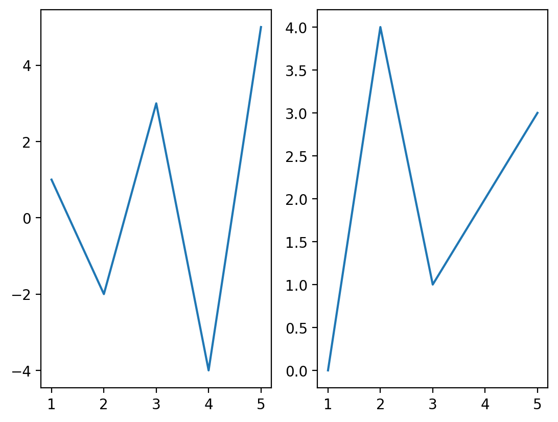
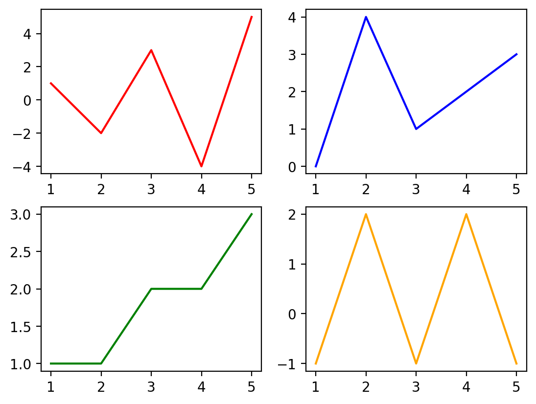
x = [1, 2, 3, 4, 5]
y1 = [1, -2, 3, -4, 5]
y2 = [0, 4, 1, 2, 3]
y3 = [1, 1, 2, 2, 3]
y4 = [-1, 2, -1, 2, -1]
fig, axs = plt.subplots(1, 2)  # nrows, ncols of axes

axs[0].plot(x, y1)
axs[1].plot(x, y2)
[<matplotlib.lines.Line2D at 0x1175864e0>]
We can even have multiple rows and multiple columns of subplots. In this case, the axs object becomes a list of lists, since there will be one list for each row of axes. Let’s inspect the axs object to verify this.
fig, axs = plt.subplots(2, 2)  # nrows, ncols of axes
axs
array([[<Axes: >, <Axes: >],
       [<Axes: >, <Axes: >]], dtype=object)
axs.shape
(2, 2)
We can see that the size of axs is 2-by-2 as expected.
Let’s use each of these and plot content on each set of axes. We’ll also adjust the color of the line in each plot by setting the color keyword to demonstrate that these are four unique plots across the four axes.
fig, axs = plt.subplots(2, 2)  # nrows, ncols of axes
axs[0, 0].plot(x, y1, color="red")
axs[0, 1].plot(x, y2, color="blue")
axs[1, 0].plot(x, y3, color="green")
axs[1, 1].plot(x, y4, color="orange")
[<matplotlib.lines.Line2D at 0x11790fc50>]
Note
it’s important to note the difference between axes and the x and y axis. A set of axes is the area of a figure upon which plots are built, while an axis (typically x or y) are the pieces that get ticks and labels (if you choose to include them).
For convenience, you may also want to give the individual axes objects names to refer to them more easily. They can be unpacked into an array of the same size as shown in the example below:
fig, [[ax_red, ax_blue], [ax_green, ax_orange]] = plt.subplots(
    2, 2
)  # nrows, ncols of axes
ax_red.plot(x, y1, color="red")
ax_blue.plot(x, y2, color="blue")
ax_green.plot(x, y3, color="green")
ax_orange.plot(x, y4, color="orange")
[<matplotlib.lines.Line2D at 0x117a8af00>]
Adjusting the width and height distribution of subplots#
We can also adjust the relative size of the subplots by adding as keyword parameters width_ratios with what fraction of the overall figure each column of subplots should occupy). You can us a similar approach to adjust the heights of the rows. Let’s adjust the size of the plots so that the first column occupies 75% of the width of the figure and the second column occupies 25%. Let’s similarly set the height of the top plot to be 67% and the bottom plot 33%.
fig, axs = plt.subplots(2, 2, width_ratios=[0.75, 0.25], height_ratios=[0.67, 0.33])
axs[0, 0].plot(x, y1, color="red")
axs[0, 1].plot(x, y2, color="blue")
axs[1, 0].plot(x, y3, color="green")
axs[1, 1].plot(x, y4, color="orange")
[<matplotlib.lines.Line2D at 0x117bfaf60>]
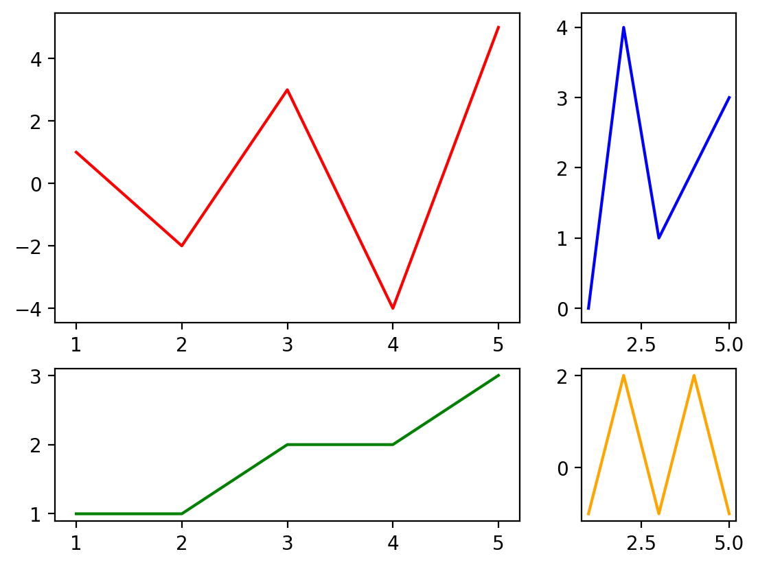
Figure size#
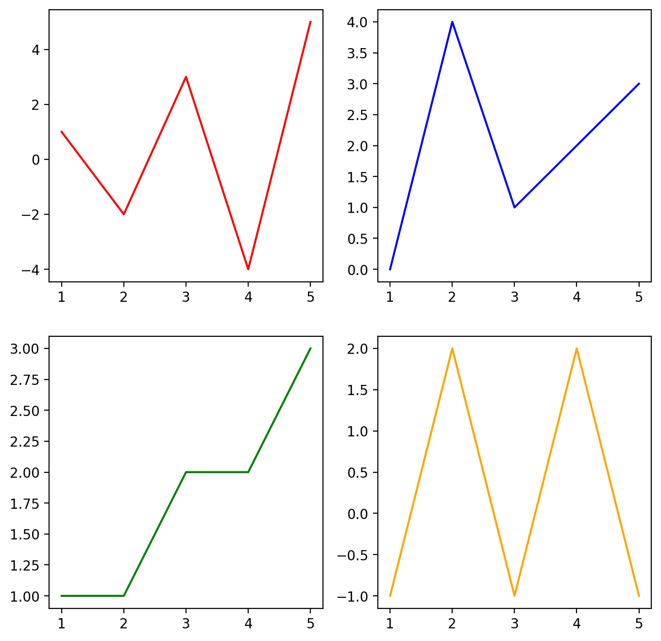
When we have many subplots on a single figure, it can sometimes be difficult to view them clearly without making the figure bigger. We can also make adjustments to make sure they’re more easily viewable. The plt.subplots() command can take any keywords that can be applied to a figure and there’s a full list of those in the documentation. One of the most common you’ll need to change is figsize which controls the overall size of the figure. This property controls the width and height of the figure in inches and the default size is [6.4, 4.8] (width of 6.4 in., height of 4.8 in.). Let’s adjust this to be a bit bigger: 8 inches wide by 8 inches high.
fig, axs = plt.subplots(2, 2, figsize=(8, 8))  # nrows, ncols of axes
axs[0, 0].plot(x, y1, color="red")
axs[0, 1].plot(x, y2, color="blue")
axs[1, 0].plot(x, y3, color="green")
axs[1, 1].plot(x, y4, color="orange")
[<matplotlib.lines.Line2D at 0x117731f10>]
Adding labels and titles to subplots#
Just like we did for any other set of axes, we can add x and y labels as well as a title. Let’s add that for each of these plots below:
fig, axs = plt.subplots(2, 2, figsize=(8, 8))  # nrows, ncols of axes

axs[0, 0].plot(x, y1, color="red")
axs[0, 0].set_xlabel("x label")
axs[0, 0].set_ylabel("y label")
axs[0, 0].set_title("My Title for Plot 1")

axs[0, 1].plot(x, y2, color="blue")
axs[0, 1].set_xlabel("x label")
axs[0, 1].set_ylabel("y label")
axs[0, 1].set_title("My Title for Plot 2")

axs[1, 0].plot(x, y3, color="green")
axs[1, 0].set_xlabel("x label")
axs[1, 0].set_ylabel("y label")
axs[1, 0].set_title("My Title for Plot 3")

axs[1, 1].plot(x, y4, color="orange")
axs[1, 1].set_xlabel("x label")
axs[1, 1].set_ylabel("y label")
axs[1, 1].set_title("My Title for Plot 4")
Text(0.5, 1.0, 'My Title for Plot 4')
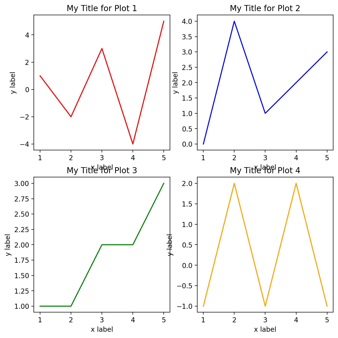
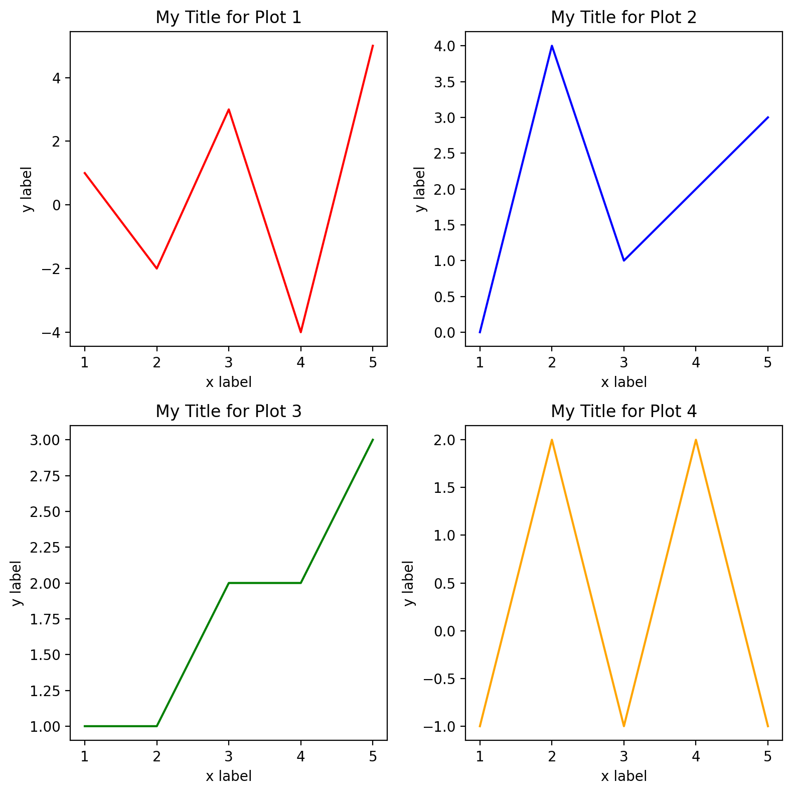
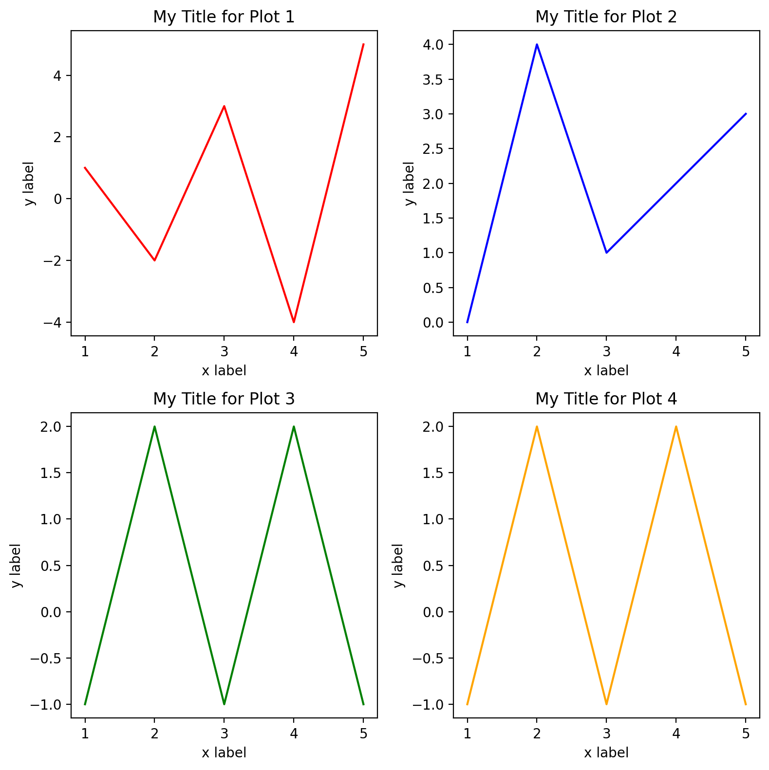
While this works well, we can immediately see a problem that content of some of plots are overlapping others. This can be easily remedied using the tight_layout() method applied to the figure that contains the axes. That method adjusts the padding around each figure so that the text should be readable. Let’s apply that here:
fig, axs = plt.subplots(2, 2, figsize=(8, 8))  # nrows, ncols of axes

axs[0, 0].plot(x, y1, color="red")
axs[0, 0].set_xlabel("x label")
axs[0, 0].set_ylabel("y label")
axs[0, 0].set_title("My Title for Plot 1")

axs[0, 1].plot(x, y2, color="blue")
axs[0, 1].set_xlabel("x label")
axs[0, 1].set_ylabel("y label")
axs[0, 1].set_title("My Title for Plot 2")

axs[1, 0].plot(x, y3, color="green")
axs[1, 0].set_xlabel("x label")
axs[1, 0].set_ylabel("y label")
axs[1, 0].set_title("My Title for Plot 3")

axs[1, 1].plot(x, y4, color="orange")
axs[1, 1].set_xlabel("x label")
axs[1, 1].set_ylabel("y label")
axs[1, 1].set_title("My Title for Plot 4")

fig.tight_layout()
Simplifying the code for making plots with loops and functions#
One thing that becomes obvious about the above subplots is that to create them involves a LOT of redundant code. One of our core programming concepts is don’t repeat yourself and we’re violating that principle here.
One way of adjusting this is to create a function that makes each plot. Since these plots are so similar, we can use the same function for each of the figures, but change the axis, data, title, and color.
def myplot(ax, x, y, title, color):
    ax.plot(x, y, color=color)
    ax.set_xlabel("x label")
    ax.set_ylabel("y label")
    ax.set_title(title)


titles = [
    "My Title for Plot 1",
    "My Title for Plot 2",
    "My Title for Plot 3",
    "My Title for Plot 4",
]
colors = ["red", "blue", "green", "orange"]
y = [y1, y2, y4, y4]

fig, axs = plt.subplots(2, 2, figsize=(8, 8))  # nrows, ncols of axes
myplot(axs[0, 0], x, y[0], titles[0], colors[0])
myplot(axs[0, 1], x, y[1], titles[1], colors[1])
myplot(axs[1, 0], x, y[2], titles[2], colors[2])
myplot(axs[1, 1], x, y[3], titles[3], colors[3])

fig.tight_layout()
Nice! This has already reduced the number of lines code we need significantly. But we can still take this one step further by iterating over our axs object. right now, everything else is easily accessed by an index from 0 through 3 (including y, titles, and colors). If we could iterate over axs in a loop, we could do this even more code-efficiently.
Presently axs is a 2-by-2 numpy array. While we could iterate over this numpy array with two nested loops, we can make this even easier with the numpy flatten function to convert the 2-D array into a 1-D array that is more easily iterable:
axs.shape
(2, 2)
axs_flattened = axs.flatten()
axs_flattened
array([<Axes: title={'center': 'My Title for Plot 1'}, xlabel='x label', ylabel='y label'>,
       <Axes: title={'center': 'My Title for Plot 2'}, xlabel='x label', ylabel='y label'>,
       <Axes: title={'center': 'My Title for Plot 3'}, xlabel='x label', ylabel='y label'>,
       <Axes: title={'center': 'My Title for Plot 4'}, xlabel='x label', ylabel='y label'>],
      dtype=object)
axs_flattened.shape
(4,)
Now, THIS, we can iterate over. Let’s use this to make plotting the subplots even more streamlined. Here remember that enclosing an iterable in enumerate allows us to keep a count of the number of iterations - we’ll use that here as well.
def myplot(ax, x, y, title, color):
    ax.plot(x, y, color=color)
    ax.set_xlabel("x label")
    ax.set_ylabel("y label")
    ax.set_title(title)


titles = [
    "My Title for Plot 1",
    "My Title for Plot 2",
    "My Title for Plot 3",
    "My Title for Plot 4",
]
colors = ["red", "blue", "green", "orange"]
y = [y1, y2, y4, y4]

fig, axs = plt.subplots(2, 2, figsize=(8, 8))  # nrows, ncols of axes

for i, ax in enumerate(axs.flatten()):
    myplot(ax, x, y[i], titles[i], colors[i])

fig.tight_layout()
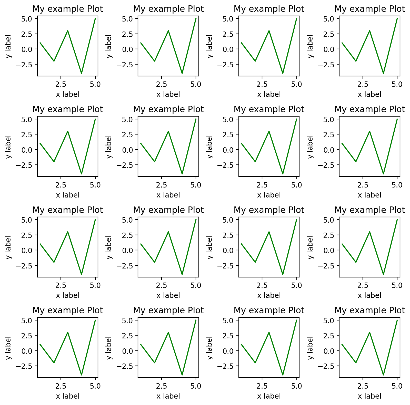
This process can be scaled up to create even more subplots. As an example, let’s make a 4-by-4 subplot where we simple place the same plot on each of the subplot axes.
def simpleplot(ax):
    ax.plot(x, y1, color="green")
    ax.set_xlabel("x label")
    ax.set_ylabel("y label")
    ax.set_title("My example Plot")


fig, axs = plt.subplots(4, 4, figsize=(8, 8))  # nrows, ncols of axes

for i, ax in enumerate(axs.flatten()):
    simpleplot(ax)

fig.tight_layout()
Subplots with multiple types of plots#
While the above approach works best when your making many plots that share common characteristics, you can always create a function that takes as an input an axes object and produces a plot. Then you can easily arrange the plots however you’d like in terms of the order of the subplots. Let’s say we wanted a line plot for one subplot, a bar plot for another, and a scatter plot for a third. Let’s see an example of how we could do this.
# First create a function to make each of the subplots
def plot_line(ax):
    ax.plot(x, y1)
    ax.set_xlabel("x label")
    ax.set_ylabel("y label")
    ax.set_title("My Line Plot")


def plot_bar(ax):
    ax.bar(x, y2)
    ax.set_xlabel("x label")
    ax.set_ylabel("y label")
    ax.set_title("My Bar Plot")


def plot_scatter(ax):
    ax.scatter(x, y3)
    ax.set_xlabel("x label")
    ax.set_ylabel("y label")
    ax.set_title("My Scatter Plot")


fig, axs = plt.subplots(1, 3, figsize=(9, 4))  # nrows, ncols of axes

plot_line(axs[0])
plot_bar(axs[1])
plot_scatter(axs[2])

fig.tight_layout()
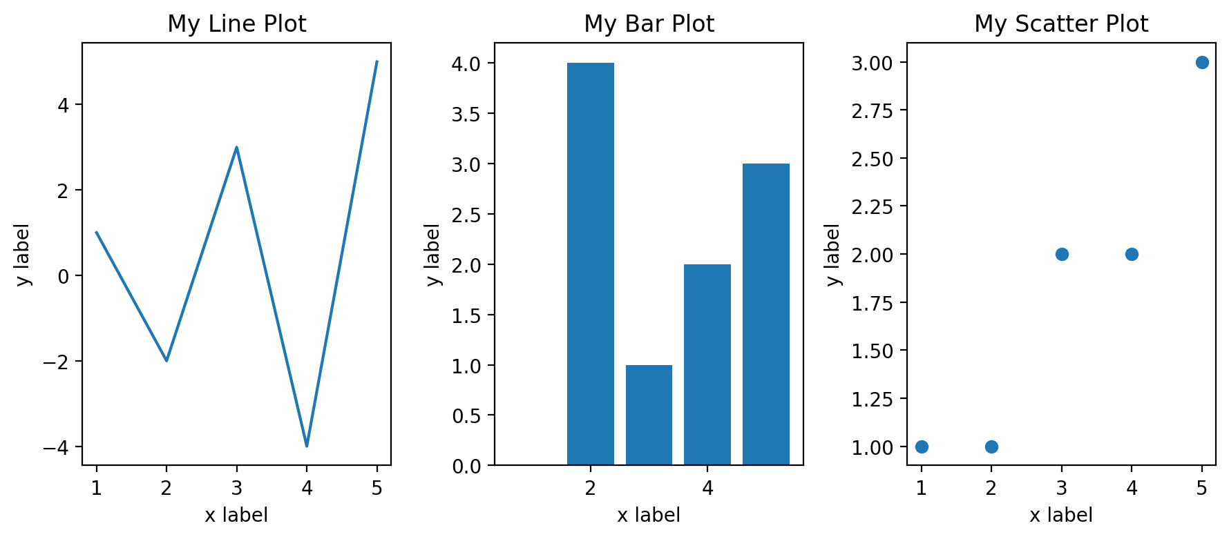
While this approach still uses a bit of code, it’s very clear to read what’s going on in the process of making the plots and how they are arranged. It’s also easy to rearrange them as needed.
Recap#
In this section, you learned…
How to create subplots
How to set the number and structure of subplots in a figure
How to create code for similar subplots and create functional structures for making subplots containing multiple types of plots