Plotting best practices#
Plotting effectively is more than just displaying data accurately, it’s communicating effectively. This is a learned skill and likely does not come intuitively to most. This section provides a set of general best practices to consider when plotting and some examples of those principles in action. We’ll first discuss some overall goals to keep at the front of mind when plotting, then we’ll discuss some recommended principles to follow when making a plot, and we’ll end with some personal (opinionated) preferences and pet peeves for plotting.
Place your goal at the center of every plot#
Focus on your goal. Every plot should have a communicative purpose, and that purpose is typically either to inform or to persuade (although NEVER to mislead) through evidence. This means that every plot should have a message that it communicates. Be sure you know what message you want to convey and keep your focus on that message. If you’re not able to identify your plot’s message, neither will a viewer.
Know your audience. You’re communicating to people with lived experiences that may or may not include what you plan to show them with your plot. Target what you plot and how you plot it, annotate it, and caption it to reach your intended audience and accomplish your goal.
Make it professional. Not every plot needs to be beautiful; but every plot that is shared with others should be sufficiently professional for that audience. If you’re sharing some quick results with colleagues, the plot likely needs to be clean and readable; if you’re sharing a plot publicly, you want that plot to be a reflection of the level of professionalism that went into the data within it. This also helps to build trust and credibility.
Best practices to follow when plotting#
The following practices are a combination of practices from our own community and from the numerous resources included in the reference section, especially Rougier et al.’s “Ten Simple Rules for Better Figures.”
1. Be honest#
Plots can be compelling forms of communication and it’s easy to mislead. Make sure your data are accurate AND are accurately portrayed. Plotting should share information ethically and never seek to deceive or cover up truth.
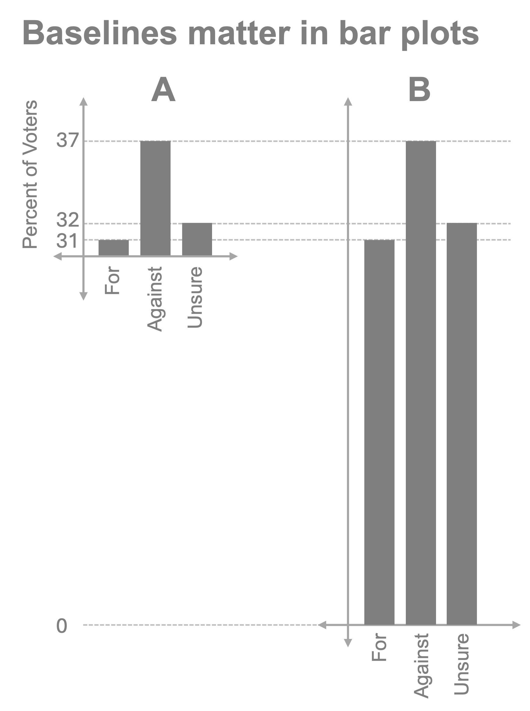
Consider the example below where we have two bar plots, A and B, both displaying the same data. The one on the left sets the baseline at 30 rather than 0. The visual impact is that almost all the voters appear to be against the measure, when in reality (as more accurately conveyed in B), the gap between those for and against is only 4 points and over 30% of voters are undecided. Showing plot A is deceptive. Plot B honestly conveys the data. In almost all cases, the value of 0 should be used as the baseline for bar plots, and many others, when possible.
2. Be aware of the human reading the chart: follow the science of visualization#
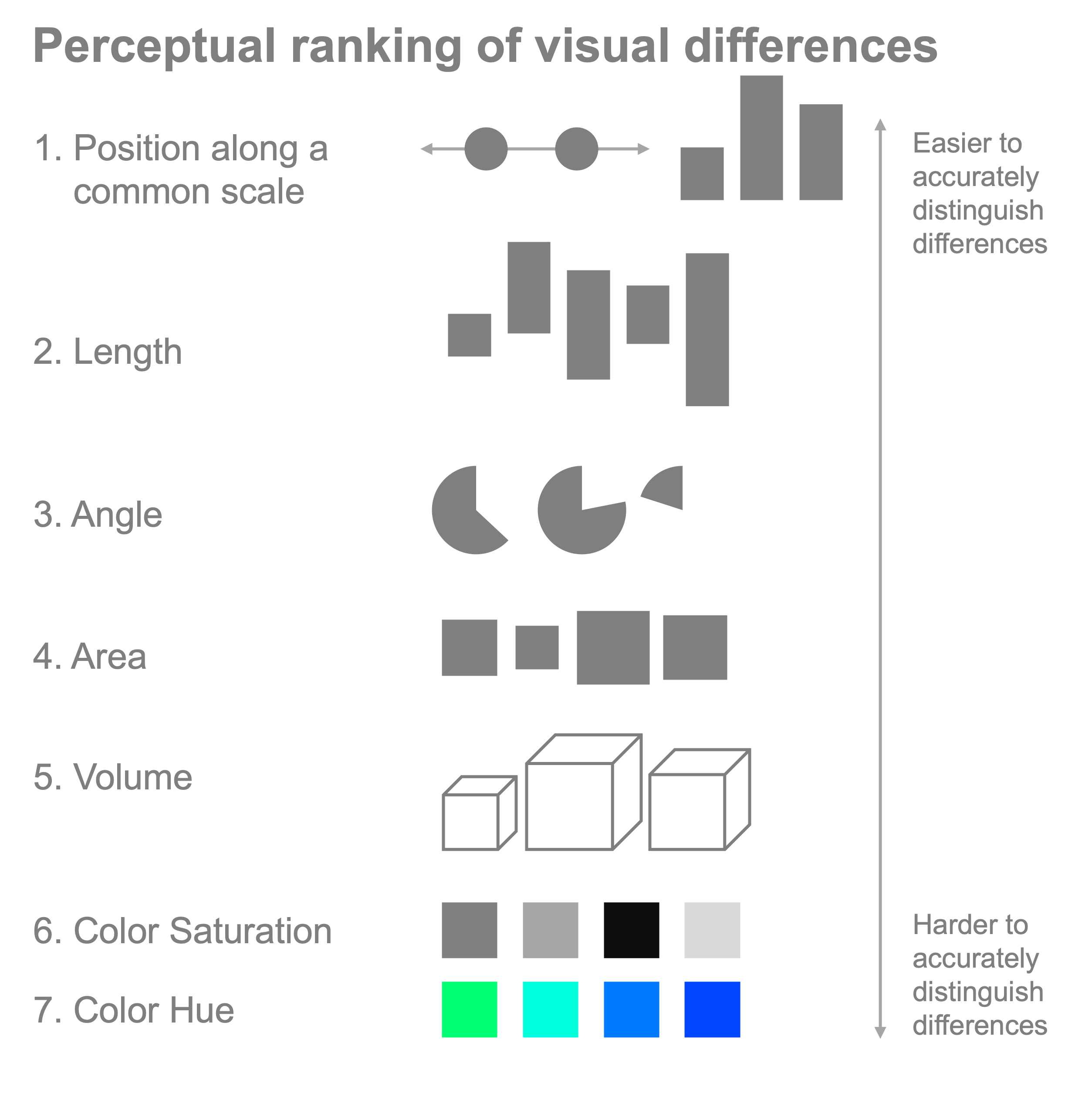
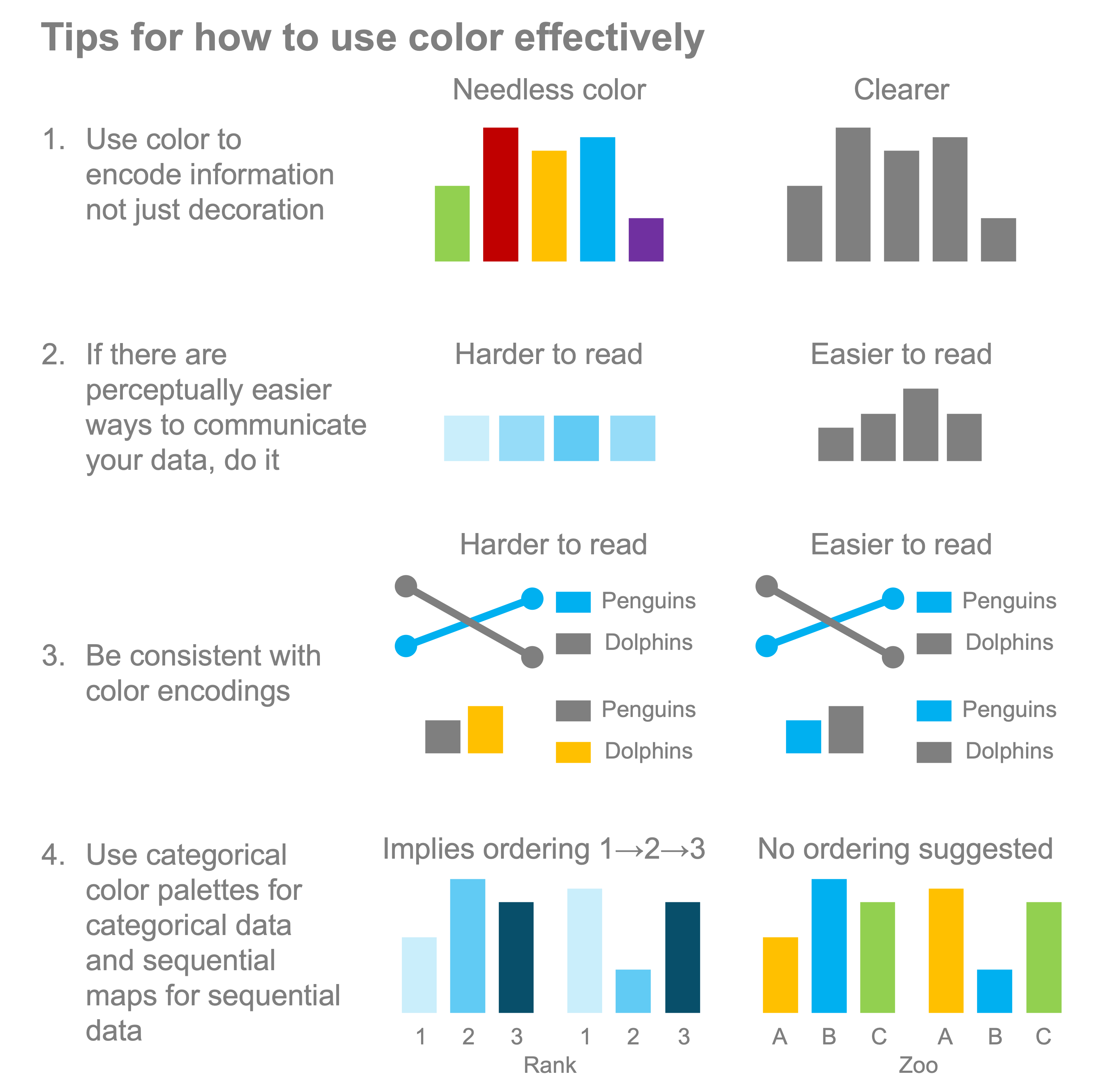
The human visual system is an incredible pattern detection system and can quickly interpret visual data. It can also be easily fooled into misreading information if faced with common illusions. For example, not using 0 as a baseline for bar charts (and many other forms of plots) can misrepresent the data in the chart. Follow the science of human perception as it relates to data visualization. We share several resources on this topic in the references. For example, humans have a hierarchy of efficacy around how well we’re able to perceive differences. Cleveland and McGill (1985) measured the perceptual differences between different ways of perceiving information and how accurately humans can interpret the information presented. This has led to a clear ranking, as shown below with position along a scale and length differences being the best (lending credence to the ubiquity of line and bar plots) and at the bottom end of the scale are differences in color, which is why we need to be cautious in how we use color to encode information. Use this knowledge to choose options that are the most effective for interpretation.
3. Label everything, always#
Don’t hesitate, don’t think about it - always include a label for both the x and y axes of your plot and a legend if you’re plotting more than one thing. There should be no ambiguity of meaning. For your x and y axis labels, include precise units whenever possible, and for the legend use human-readable language. Your plotting tool may use your variable name of ‘popa45’ that was present in your data, but that’s a terrible legend entry since no one will know what it means. Instead, use a human-readable label like ‘population above age 45’. We also recommend a descriptive caption to go with your figure if you’re including this in a report.
4. Keep it simple: use as little “ink” as possible to accurately create your plot#
Edward Tufte coined the phrase “data-to-ink” ratio which is the ratio of the amount of ink required to print a chart divided by the quantity of information included in the chart. The idea behind maximizing the data-to-ink ratio is to make the chart as simple as possible in terms of the number of elements used while accurately conveying the information you wish to share. Let’s explore two terrible, terrible examples:
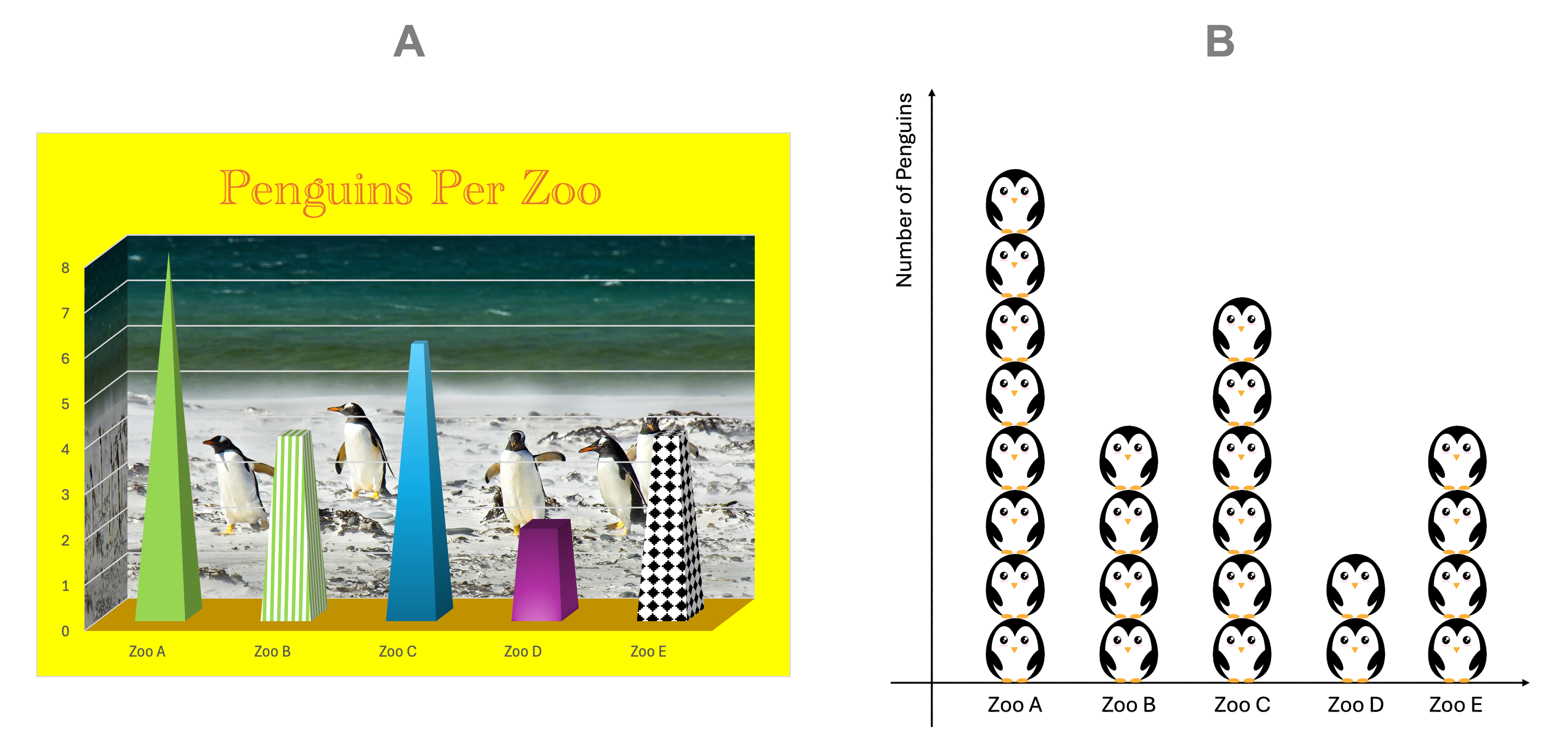
First of all, both plots accurately contain the information desired. Figure A contains a litany of poor practices that include:
It uses 3D plotting when the data are able to be presented in 2D.
The choice of 3D representation distorts the volume and misleads the reader on interpreting the data since there is more “volume” near the bottom of the pyramids then on the top.
It positively hurts your eyes with the color choices
It uses pictures (background of penguins) when the picture conveys no information
The 3D plot uses different colors and patterns for each Zoo, but they encode no information, confusing the reader
Figure B is better, and while adorable, the penguin images are not necessary and distract from the information making it harder to read. In both A and B there is a LOT of wasted “ink” for each of those plots presenting “chartjunk” that doesn’t add any information and simply confuses the reader.
Let’s create our own, high data-to-ink ratio plot with just the bare minimum:
%config InlineBackend.figure_format = 'retina'

x = ["Zoo A", "Zoo B", "Zoo C", "Zoo D", "Zoo E"]
y = [8, 4, 6, 2, 4]

import matplotlib.pyplot as plt

fig, ax = plt.subplots()

bar = ax.bar(x, y, color="darkgrey")
ax.set_ylabel("Number of Penguins")
ax.spines[["right", "top", "bottom"]].set_visible(False)
ax.tick_params(bottom=False)
ax.set_ylim([0, 8])
(0.0, 8.0)
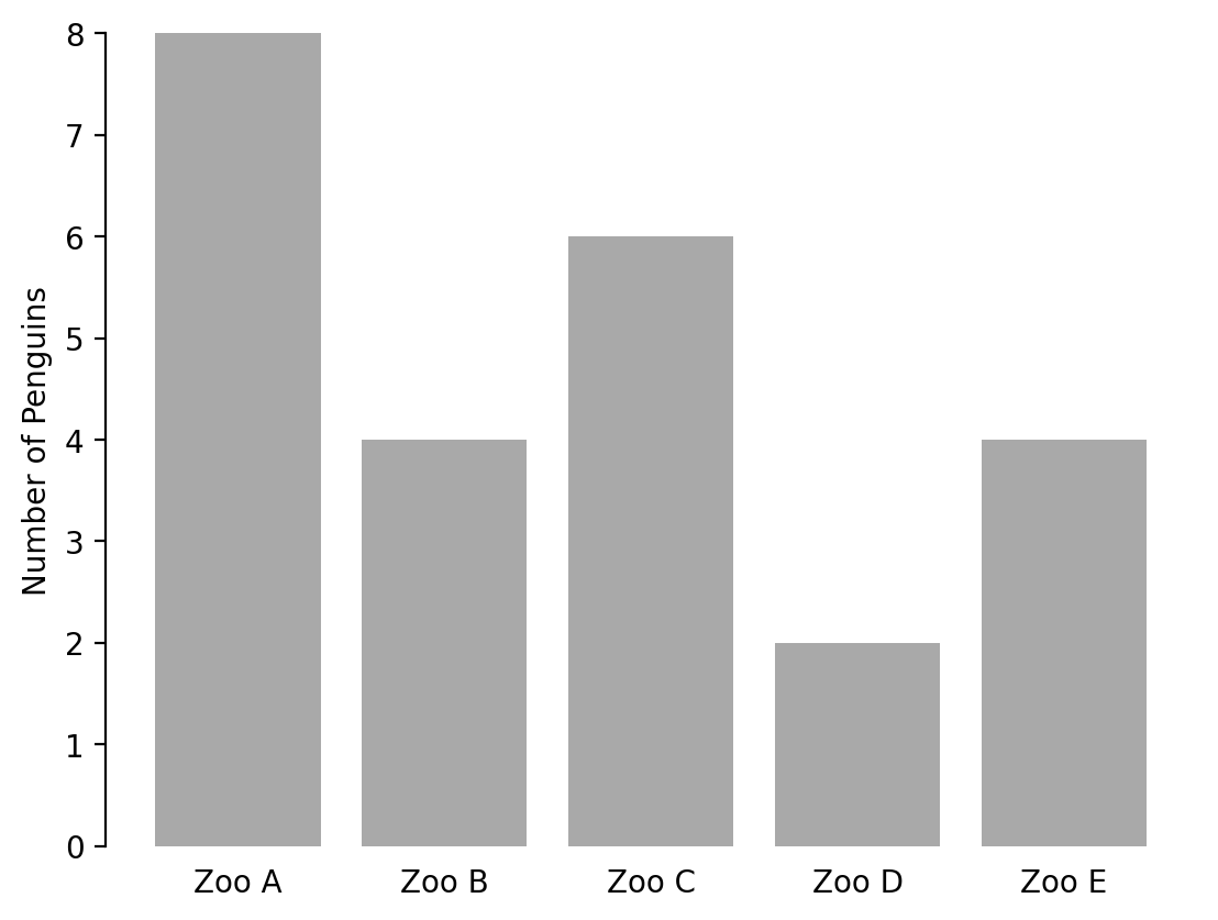
This plot is clear, simple, and easy to read.
5. Use color to your advantage rather than to your detriment.#
Color can be a powerful tool for data visualization, but it needs to be used carefully. The most important aspect of the use of color in data visualizations is that it should encode information. Do not use color solely for decoration. In that way, single-color plots and the use of greys in plots are your friend.
Consider the last plot showing penguins per zoo. There are no colors present in this plot aside from grey. However, what if the point we wanted to make was that Zoo A was by far the largest caretaker of penguins among the zoos. We can highlight that Zoo A is the focal point of the plot, but using color, as shown in the example below:
fig, ax = plt.subplots()

bar = ax.bar(x, y, color="darkgrey")
bar[0].set_color("royalblue")
ax.set_ylabel("Number of Penguins")
ax.spines[["right", "top", "bottom"]].set_visible(False)
ax.tick_params(bottom=False)
ax.set_ylim([0, 8])
(0.0, 8.0)
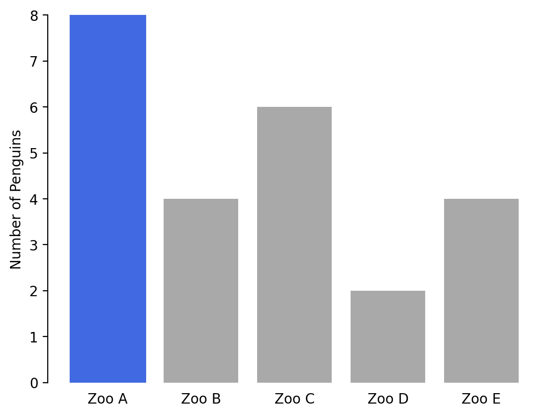
Now, the reader’s eye is immediately drawn to Zoo A and our point becomes clearer, and our data visualization more effective. It’s effective because the color has meaning. For more examples of using color to highlight data, see this DataWrapper discussion of color for emphasis with numerous examples.
Here are a few tips for optimizing the use of colors:
Another important consideration is the particular color palette that you use. Always keep in mind that human brains will be reading your plots and whenever we can make it easier for people to understand the content, we should. To that end, when using many colors, as in a heatmap, always use perceptually uniform color palettes that map uniform steps in the data to uniform perceived step changes in the color. The now-default colormap in matplotlib is viridis, which is a perceptually uniform colormap and is a good default option. There are many other colormaps that are predefined in matplotlib, including the other examples shared below viridis, and these are all reasonable options for your plotting needs.
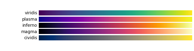
In particular, cividis is worth noting as it is a colorblind-friendly colormap and therefore a recommended option if you are sharing a visualization with a larger audience.
There are also numerous tools for helping you to pick aesthetically pleasing color schemes that provide options for selecting or designing colorblind-friendly palettes:
For more tips about color choices, you’re encouraged to read this DataWrapper post about color choice considerations in data visualization.
You may be asking: how do I choose good color palettes if I only need a few colors in my plot? Most of us aren’t artists and being able to determine what will look professional is not always intuitive. For that reason, following the principles contained in style guides that have been developed by others who consider these challenges and factor in color theory, readability, and accessibility is usually a good idea. For example, one of the best style guides I’ve seen is the Urban Institute’s data visualization style guide and similarly, the Cato Institute’s style guide is excellent. Use professional style guides and adapt them to your purpose. If you’re affiliated with an organization, check to see if that organization has a style guide you can use.
References#
Ajani, K., Lee, E., Xiong, C., Knaflic, C.N., Kemper, W. and Franconeri, S., 2021. Declutter and focus: Empirically evaluating design guidelines for effective data communication. IEEE Transactions on Visualization and Computer Graphics, 28(10), pp.3351-3364.
Cairo, A., 2016. The truthful art: Data, charts, and maps for communication. New Riders.
Cairo, A., 2019. How charts lie: Getting smarter about visual information. WW Norton & Company.
Cleveland, W.S. and McGill, R., 1985. Graphical perception and graphical methods for analyzing scientific data. Science, 229(4716), pp.828-833.
Franconeri, S.L., Padilla, L.M., Shah, P., Zacks, J.M. and Hullman, J., 2021. The science of visual data communication: What works. Psychological Science in the public interest, 22(3), pp.110-161.
Muth, Lisa Charlotte, 2022. A detailed guide to colors in data vis style guides. DataWrapper blog
Muth, Lisa Charlotte, 2023. Emphasize what you want readers to see with color. DataWrapper blog
Rougier, N.P., Droettboom, M. and Bourne, P.E., 2014. Ten simple rules for better figures. PLoS computational biology, 10(9), p.e1003833.
Tufte, Edward R.,2001. The Visual Display of Quantitative Information. Cheshire, Conn. Graphics Press