Plotting with Pandas#
It might surprise you to be reading about pandas in a week about plotting, but when it comes to making quick exploratory plots, pandas actually has a lot to offer.
Indeed, pandas not only comes with a built-in plotter for directly plotting pandas data in matplotlib (e.g., df.plot()), but with the kind argument (e.g., df.plot(kind="...")) you can also get pandas to quickly generate many of the plots we’ve discussed here:
bar plots (
"bar"or"hbar"), which can be stacked (stacked=True) or groupedhistograms (
"hist")boxplots (
"box")histogram/density plots (
"density"or"kde")area plots (
"area")scatter plots (
"scatter")hexagonal bin plots (
"hexbin")pie plots (
"pie")
In all cases, the use of these methods will return a matplotlib object you can then modify further using standard matplotlib methods if you want!
Our basic plotting structure remains the same:
fig, ax = plt.subplots()
<plot things here using pandas methods to the axis 'ax'>
<modify the plot components for customizations>
Example: Bar plots#
Let’s look at a specific example using bar plots. We’ll start with our farm production example from earlier which contains the following data:
%config InlineBackend.figure_format = 'retina'

import pandas as pd
import numpy as np
import matplotlib.pyplot as plt

data = {
    "Farm A": [50, 75, 36],
    "Farm B": [15, 98, 33],
    "Farm C": [0, 20, 77],
}
columns = ["Grain", "Wheat", "Barley"]

df = pd.DataFrame.from_dict(data, orient="index", columns=columns)
df
| Grain | Wheat | Barley | |
|---|---|---|---|
| Farm A | 50 | 75 | 36 |
| Farm B | 15 | 98 | 33 |
| Farm C | 0 | 20 | 77 |
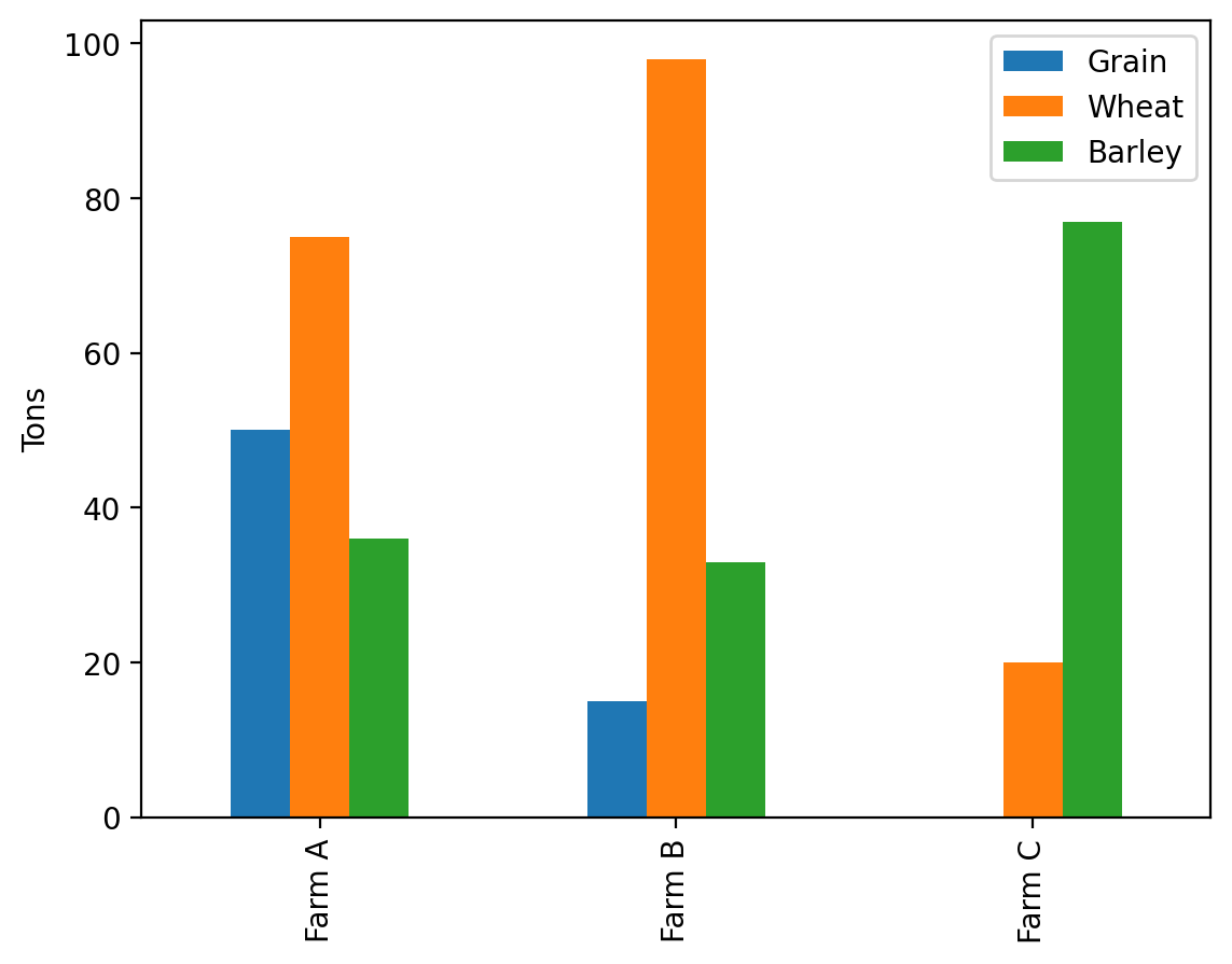
Let’s go ahead and make a simple bar plot from this DataFrame. We can do this with the pandas method plot and specify the keyword argument kind to be the type of plot we want and the ax to be the Axes object we want to plot it on.
fig, ax = plt.subplots()
df.plot(kind='bar', ax=ax)
ax.set_ylabel('Tons')
Text(0, 0.5, 'Tons')
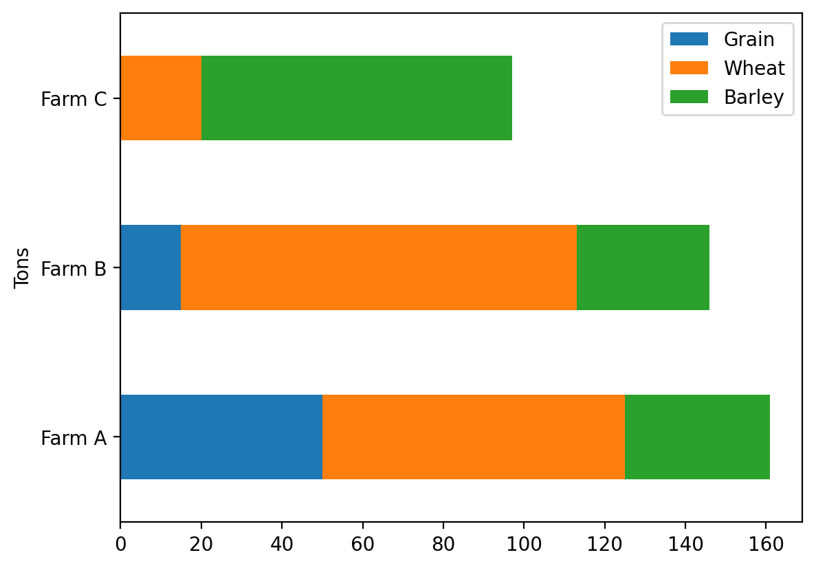
We can change it from a grouped plot to a stack plot by setting one simple keyword argument: stacked = True.
fig, ax = plt.subplots()
df.plot(kind='bar', ax=ax, stacked=True)
ax.set_ylabel('Tons')
Text(0, 0.5, 'Tons')

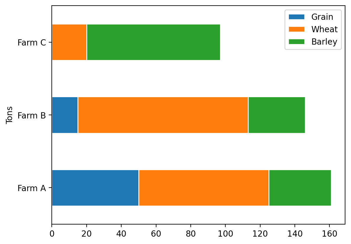
We can switch it to horizontal bars just as easily by switching the kind of plot from bar to barh:
fig, ax = plt.subplots()
df.plot(kind='barh', ax=ax, stacked=True)
ax.set_xlabel('Tons')
Text(0, 0.5, 'Tons')
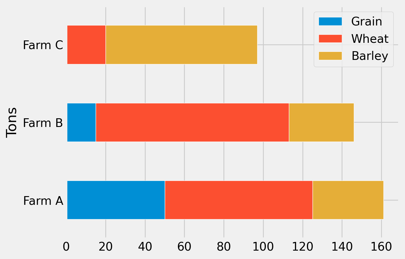
We can even modify the properties of the objects as we would if we were plotting directly with the matplotlib bar plot method itself. For example, let’s say we wanted to set the edgecolor property for the bar plot to ‘white’. We add it into the pandas method instead:
fig, ax = plt.subplots()
df.plot(kind='barh', ax=ax, stacked=True, edgecolor='white')
ax.set_xlabel('Tons')
Text(0, 0.5, 'Tons')
We can also apply styles to the plots as before. Let’s apply the ‘fivethirtyeight’ style here:
plt.style.use('fivethirtyeight')
fig, ax = plt.subplots()
df.plot(kind='barh', ax=ax, stacked=True, edgecolor='white')
ax.set_xlabel('Tons')
Text(0, 0.5, 'Tons')
These pandas tools can save on coding and enable you to focus more time on what matters: exploring your data!
To learn more or to see more examples, check out the panda’s documentation on charting here.