Plotting with matplotlib#
Why use matplotlib?#
While seaborn is a versatile tool to accomplish most plotting tasks, you may find there are situations in which you need a greater degree of customization. This additional flexibility can be accomplished with the most common Python plotting tool, matplotlib, although the more advanced applications do have a steeper learning curve. You can construct nearly any static plot you can imagine using matplotlib given sufficient patience to do so.
Before we dive into how to use this tool, take a look at this gallery of examples of matplotlib in action. There is no shortage of possibilities of plots including: line plots, scatter plots, bar plots, contour plots, heatmaps, image plots, quiver plots, box plots, errorbar plots, pie plots, polar plots, 3 dimensional plots, and many more. Enhancing these many types of plots is the ability to annotate plots with shapes and text, adjust colors and styles to your delight, customize legends, adjust axes, create subplots, and combine plot types to create the plot you’ve always been dreaming of.
The basic plotting features of matplotlib can be learned quickly; however, advanced plotting and customization requires a deeper knowledge of this plotting tool. Becoming proficient with using matplotlib is well-worth it, since many Python data science tools and APIs use matplotlib as a native plotting tool, including pandas and xarray.
Basic Plotting#
Getting started with plotting using matplotlib is relatively simple for the most basic plots such as line plots, bar plots, and scatter plots. Let’s create a quick plot of each of these. First, let’s create some data to plot:
# Create some data to plot
x = [1, 2, 3, 4, 5]
y = [1, -2, 3, -4, 5]
Creating a basic plot is simple. We start by importing the pyplot module from the matplotlib package. As a convention we import it as plt with the command import matplotlib.pyplot as plt. You’ll want to start every plotting session with this command. The next step is to create our canvas on which we’ll add out plots. We can use plt.subplots() to create a figure that contains a set of axes on which to place the plot through the command fig, ax = plt.subplots(). Then, we can create a line plot of the data on the specified axes using ax.plot(x,y). Lastly, we specify that the plot be rendered on the screen using plt.show(). This last item is not always required in an interactive terminal or in Jupyter notebooks, but is generally required to guarantee the plot is displayed.
Note
At times in this course, we’ll omit plt.show() for brevity and since many interactive environments will render this redundant, but it’s a good practice to include plt.show() at the end of any scripts that you are not running in interactive environments.
import matplotlib.pyplot as plt

fig, ax = plt.subplots()
ax.plot(x, y)
plt.show()
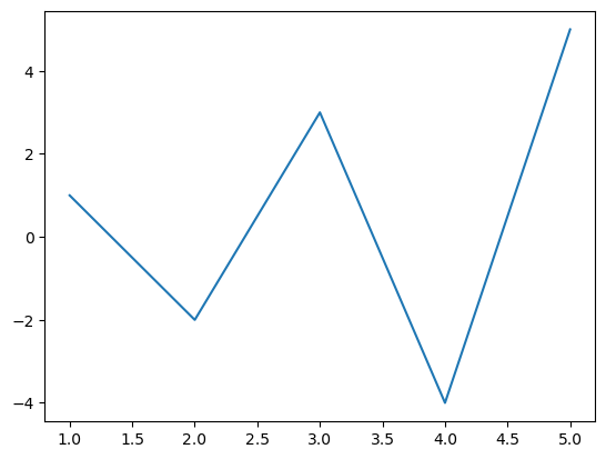
That’s it! Your first plot is complete.
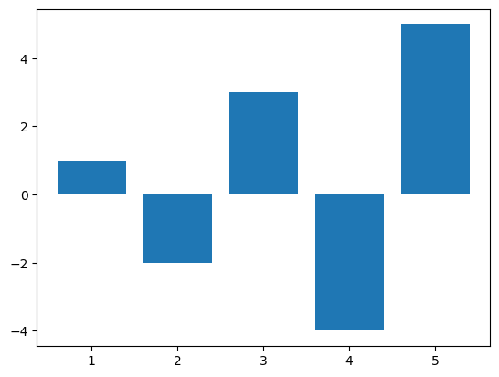
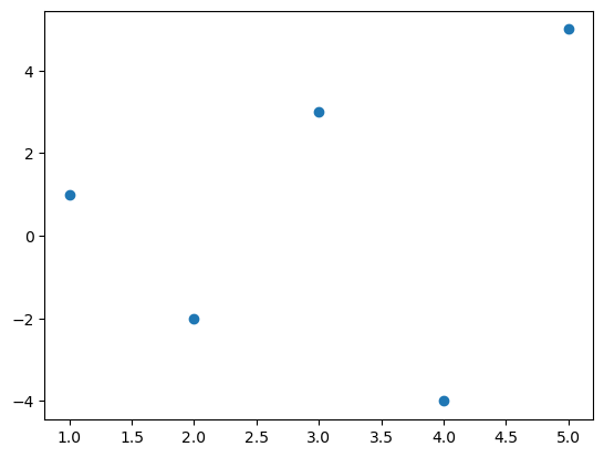
Following the same approach, we can create a simple bar plot and a scatter plot of the same data.
fig, ax = plt.subplots()
ax.bar(x, y)
plt.show()
fig, ax = plt.subplots()
ax.scatter(x, y)
plt.show()
Managing Resolution#
Many people like to increase the default resolution of matplotlib plots when they appear in Jupyter Notebook by adding the following IPython Magic command (note these have to include the %):
%config InlineBackend.figure_format = 'retina'
However, this will cause issues if your code gets exported from the jupyter notebook (e.g., in an autograder), so I prefer:
import matplotlib_inline
matplotlib_inline.backend_inline.set_matplotlib_formats("retina")
instead.
import matplotlib_inline
matplotlib_inline.backend_inline.set_matplotlib_formats("retina")
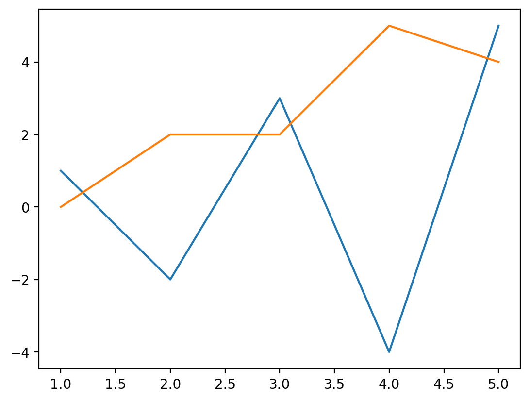
Multiple plots on the same Axes#
Often, we want to overlay multiple plots to compare them. That’s easy with matplotlib, just use the method for the plot type you want again and apply it to the same set of axes.
# Create some data to plot
x = [1, 2, 3, 4, 5]
y1 = [1, -2, 3, -4, 5]
y2 = [0, 2, 2, 5, 4]

fig, ax = plt.subplots()
ax.plot(x, y1)
ax.plot(x, y2)
plt.show()
We can also have multiple types of plotting objects on the same set of axes. Let’s mix together all three of the elements we’ve seen so far (lines, scatter plots, and bars) into a single plot.
# Create some data to plot
x = [1, 2, 3, 4, 5]
y1 = [1, 2, 3, 4, 5]
y2 = [0, 2, 2, 5, 4]
y3 = [0.5, 4, 0.75, 2, 1]

fig, ax = plt.subplots()
ax.plot(x, y1)
ax.scatter(x, y2)
ax.bar(x, y3)
plt.show()
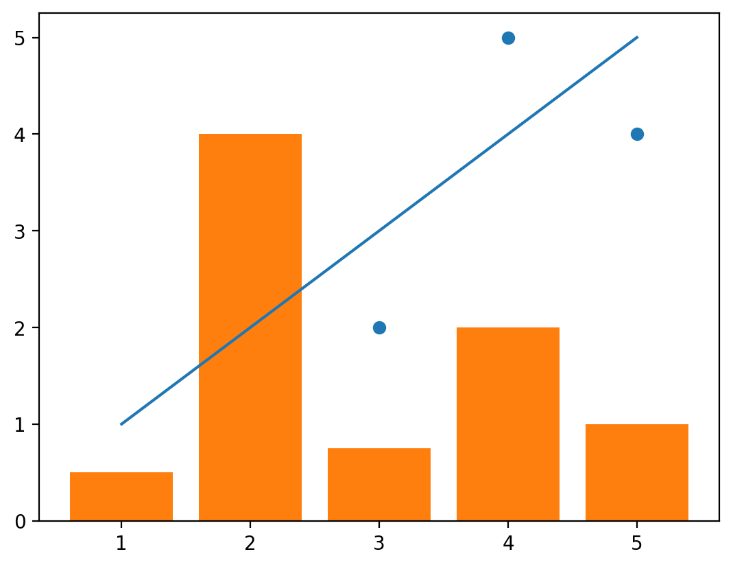
There are two things we’ll note here.
The first is that when we mix plot types together, the colors don’t always differentiate themselves as well as we’d like, as shown here between the line and scatter plots. But this is an easy fix that we can make by setting the color keyword argument. We’ll see later that matplotlib can be customized extensively. Note that not every plotting function uses the color keyword argument for adjusting the color of the plotted items, but you can always check the matplotlib documentation if you have any questions or if something doesn’t appear to be working - the documentation is exceptionally helpful.
Let’s start by changing the color of the plots:
# Create some data to plot
x = [1, 2, 3, 4, 5]
y1 = [1, 2, 3, 4, 5]
y2 = [0, 2, 2, 5, 4]
y3 = [0.5, 4, 0.75, 2, 1]

fig, ax = plt.subplots()
ax.plot(x, y1, color="gray")
ax.scatter(x, y2, color="black")
ax.bar(x, y3, color="orange")
plt.show()
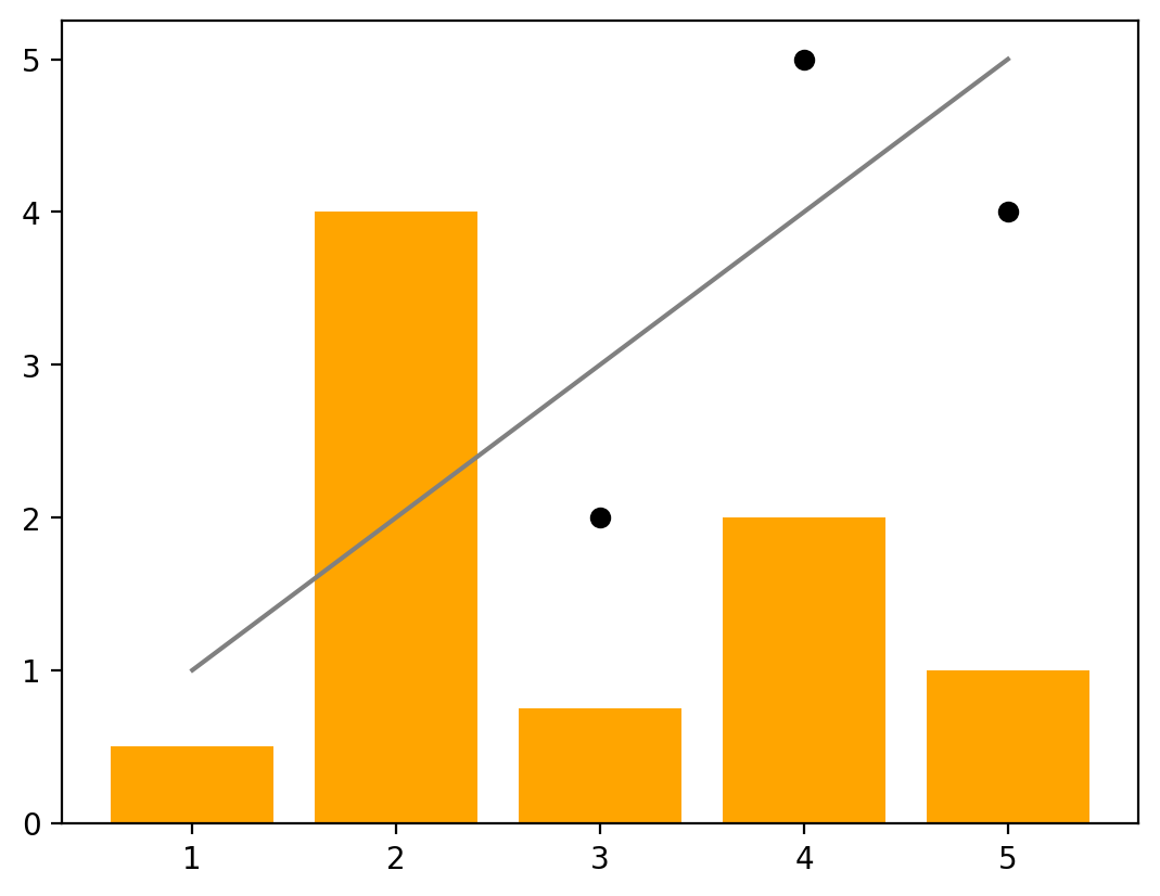
The second issue with the plot above is that the order of the plots is not what we prefer since the bar plot is covering up some of the scatter plot points. This is another easy fix that we can make by setting the zorder keyword argument for each plot. Plots with higher zorder values will show up above those with lower zorder values. We’ll set the zorder for the scatter plot to be on top (we’ll set it to 3) and the bar plot to be on the bottom (set it to 1).
# Create some data to plot
x = [1, 2, 3, 4, 5]
y1 = [1, 2, 3, 4, 5]
y2 = [0, 2, 2, 5, 4]
y3 = [0.5, 4, 0.75, 2, 1]

fig, ax = plt.subplots()
ax.plot(x, y1, color="gray", zorder=2)
ax.scatter(x, y2, color="black", zorder=3)
ax.bar(x, y3, color="orange", zorder=1)
plt.show()

Now we can read this more easily and see all of our data plotted on the same set of axes!
At it’s most basic, that’s all you need for plotting. Of course, these plots are missing many important things that you may want to include: axis labels, legends, grid lines, title, and more. We can customize each of these. In the next section, we’ll dive into each of those, and discuss the different components of a plot that you may want to customize and common adjustments and uses of each.